
Corporate Identity for counterpulse audio
Counterpulse audio creates software, tools and Apps dealing with sound.
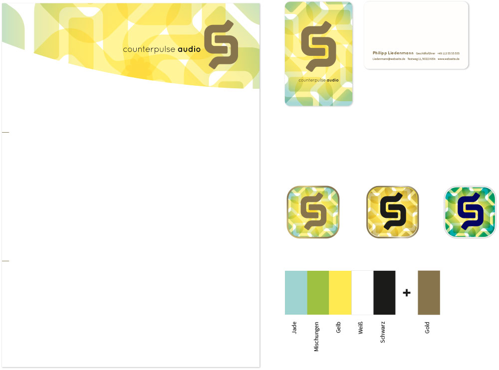
The core idea was to let the CI play with the elements of sound waves and modular systems. The initials »CP« create a playful background pattern that can easily be varied without loosing its identity. To show the facets from print to digital, the CI is shown in a letterhead, a business card and as an App icon.
CLIENT
counterpulse audio
CONCEPT & DESIGN
Peter Machat
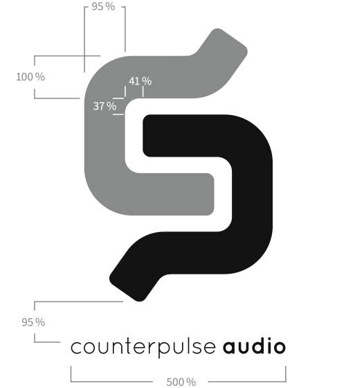
The line thickness is adjusted to make it look balanced and harmonic.
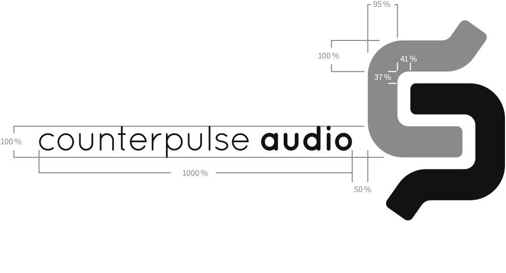
An additional landscape version that emphasizes more on the company name than on the initials.
design process

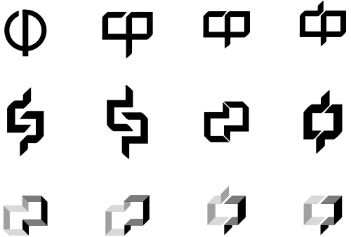
first drafts
I. The initials „cp“ form an infinity symbol, a cycle, a wave. Whether sound, movement or loops — recurrent elements in a state of intuitive movement.

II. Two interlocking elements form, through simple rotation, the initials “cp”. The negative space between them frames a periodic wave — resembling a sound wave.
III. The space/room. Since “counterpulse audio” is a sound tool based on a virtual room, in this design the initials „cp“ form a virtual room.

design variations of the selected favorite
The idea of two interlocking elements was selected and developed further until one design remained.
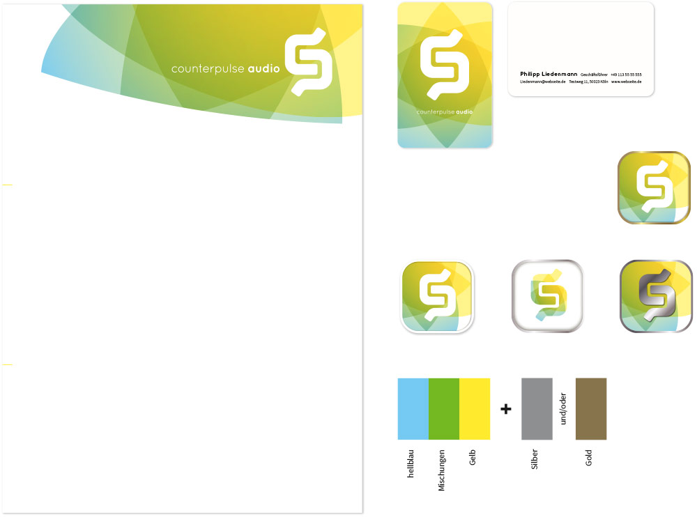
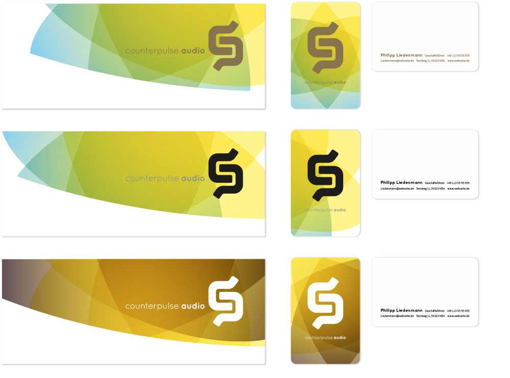
color variations
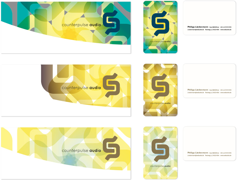
Corporate color variation II. This design is based on transparent gradients which give the CI a playful airiness. Overlapping gradients create new shades and colors which can be varied without loosing the brand recognition.
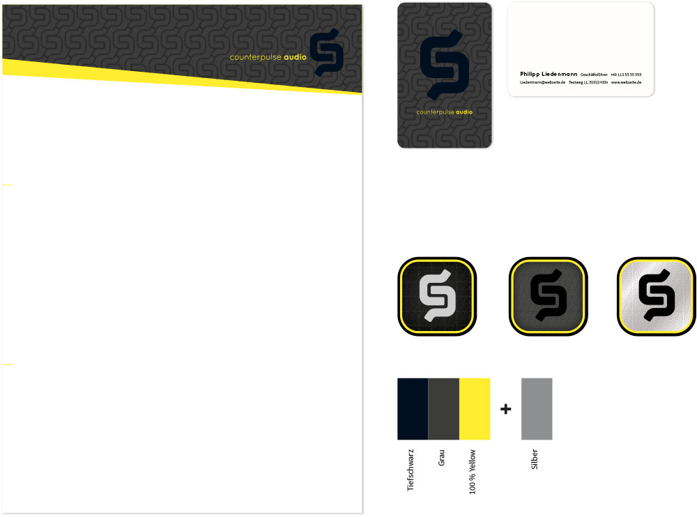
Corporate color variation III. Jet black logo combined with 100 % yellow on a micro pattern (the micro pattern in this images is enlarged to make it visible on screen). This design is printable without pantone or spot colors. Even a simple home printer can print it beautifully. To increase its strength for printed products, the jet black can be covered with a brilliant varnish.


